Case study · 2025 – 2026
Frames Studio
The showcase site of a fictional film director, designed in 2025 and rebuilt in 2026: a bold palette, a single typeface and cards that build up frame by frame. Design and code.
- Role
- Art direction, UI design and development, solo. Code written with Claude.
- Stack
- Next.js · React · TypeScript · Payload CMS · MongoDB · GSAP · Tailwind CSS · Cloudflare R2
- Status
- Live demo, fictional content
01Context
A site to show films, and make people want to talk about them.
I designed Frames in 2025 for a director I know, who in the end didn't need it. In 2026, I rebuilt it from end to end as an honest demo: the director, the films and the partners are fictional, and the site says so.
The need
Present very different projects (fiction, documentary, short formats, advertising), tell the story behind each film, and be easy to contact.
My role
Art direction, Figma mockups, Next.js build, Payload CMS setup, deployment and demo content.
The constraints
Content that can be edited without me (CMS), a fast site despite many images, readable and usable with a keyboard as well as a finger.
02Before / after
A first version, then a complete redesign.
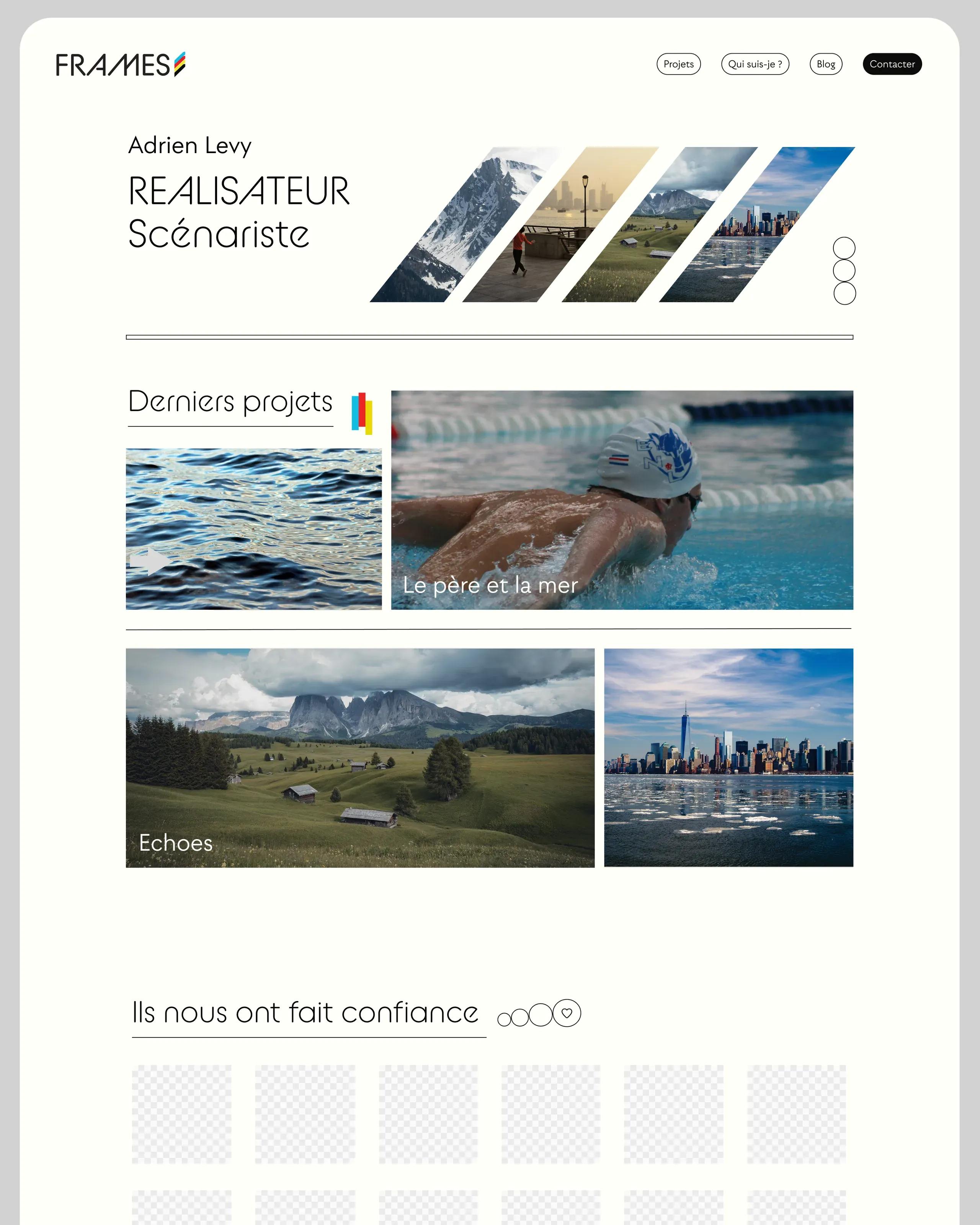
The 2025 structure was there: a hero with slanted images, project cards, services. The redesign focused on consistency (one typeface, a bold palette), the content, and everything you don't see: stable versions, server-side data, accessibility.
Before
After
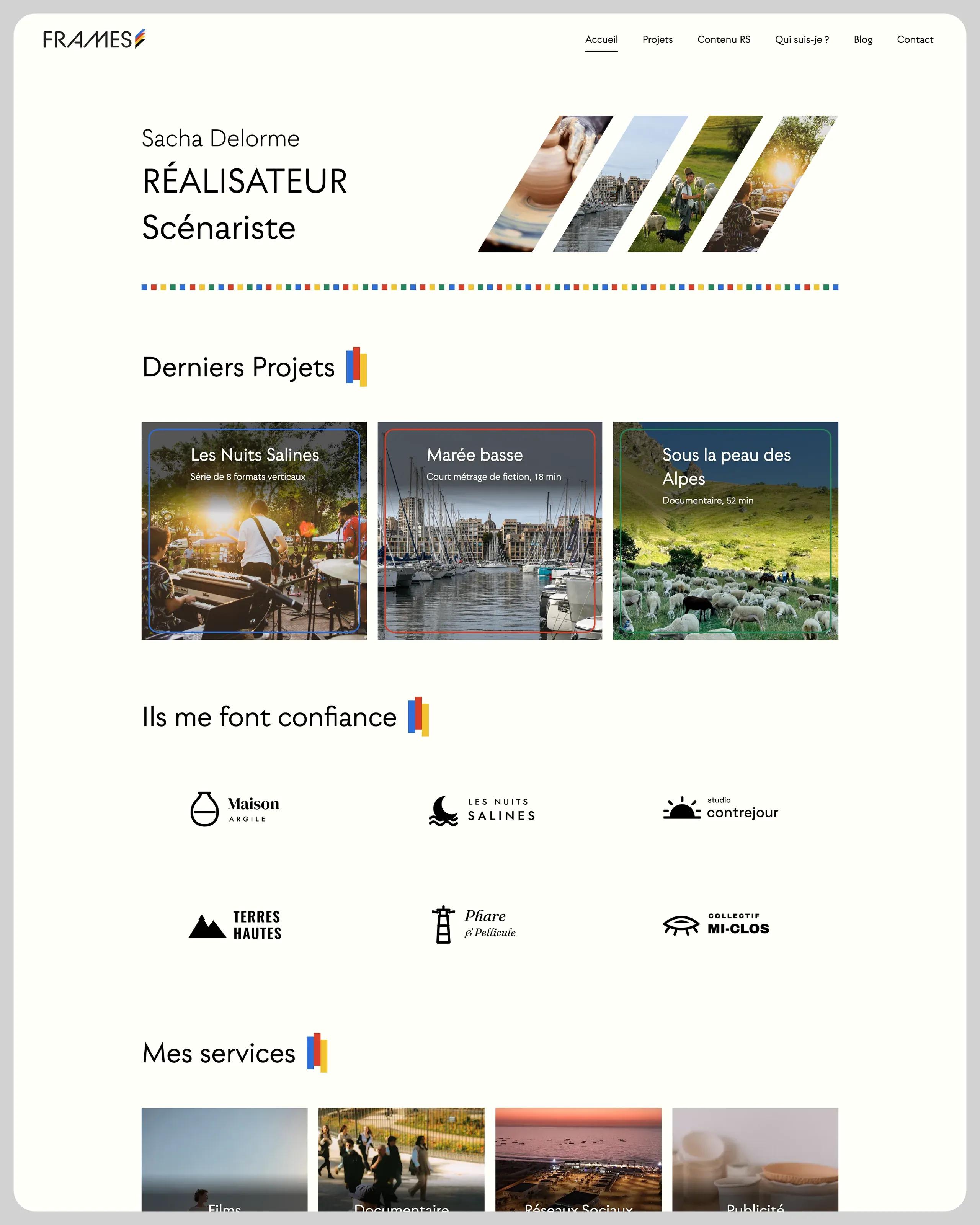
What changed
- One typeface (Utily) instead of three
- A bolder palette, color in flat areas
- Flat navigation, no submenu
- Cards animated frame by frame
- Untested dark theme removed
- Payload beta → stable release
03Art direction
A bold palette, a single typeface.
Each category has its own color, taken from the logo. Color comes in clean flat areas (frames, squares, hover backgrounds) instead of semi-transparent overlays that dulled the photos. Every text/background pair reaches at least 4.5:1: on yellow, the text turns black.
A single typeface, Utily, for headings and body text alike. It is served by the site itself, with no outside service.
Colours
- Red#D83E2A
Films
White text 4.52:1
- Green#27865A
Documentaries
White text 4.52:1
- Blue#2E6FD8
Social media
White text 4.79:1
- Yellow#F4C430
Advertising
Black text 12.78:1
- Off-white#FFFFF9 — Background, the projection screen
- Black#000000 — Text and headings
- Grey#D2D2D2 — Rules and page frame
Typefaces
Utily
Headings and body, weights 300 to 700
04Components and animations
Animations that recall film stock.
Cards build up frame by frame, like a film countdown. Text never moves, animations also play with a keyboard or a finger, and they disappear when someone asks for reduced motion.
The same motif comes back across the site: under the header, a film strip of small colored squares builds from left to right in 0.6 s.
Project card: five squares rise from bottom to top, 0.07 s apart (GSAP), then the “Voir le projet” (view project) link slides into place.
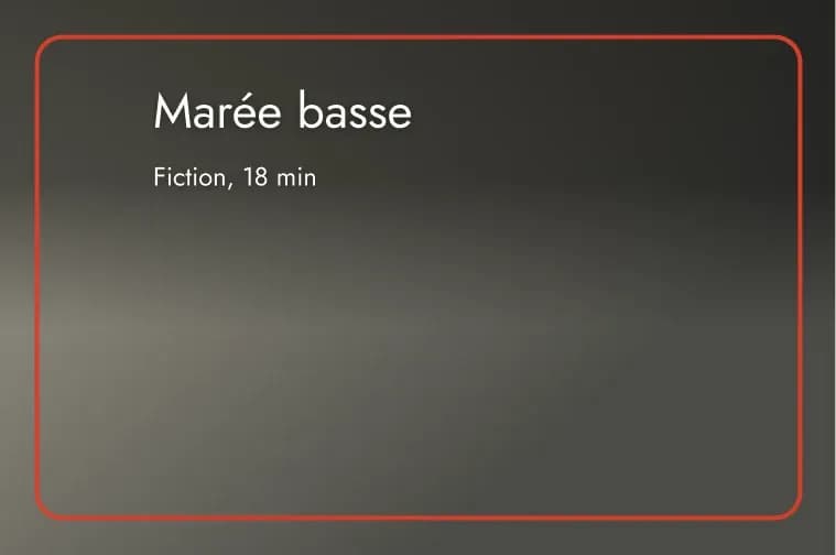
At rest
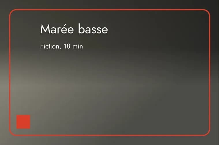
0.07 s
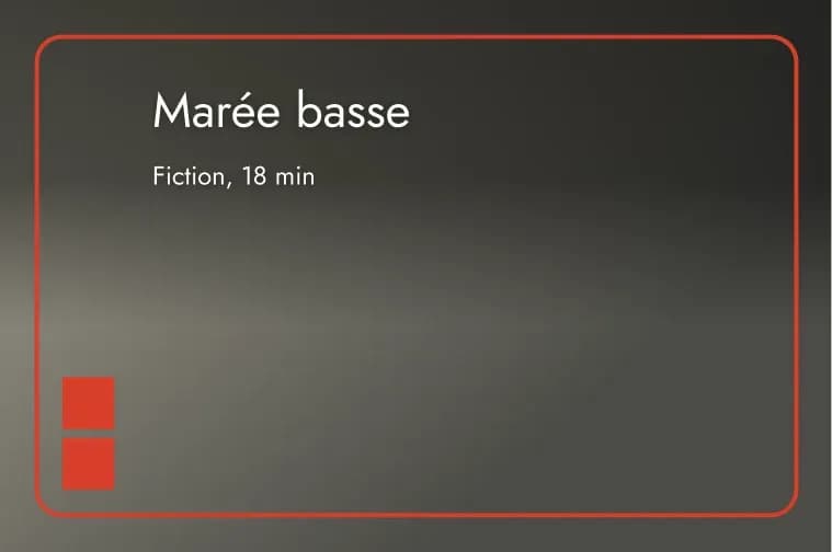
0.14 s
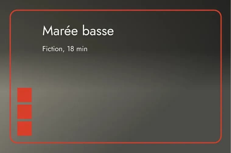
0.21 s
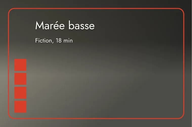
0.28 s
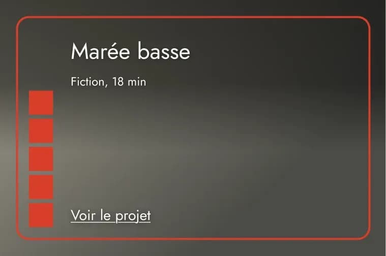
0.7 s · View project
A card that builds up on hover.
On hover or keyboard focus, five squares in the category color rise one by one: red for films, green for documentaries, blue for social media, yellow for advertising. Then “Voir le projet” appears. Blog cards use the same gesture.
A flat color that leads to the projects.
On hover, the service color slides in from the left and fills the card. The name moves down in capitals, with a sentence below. A click opens the project list filtered on that category, with its introduction.
An illustration that animates once.
I drew Sacha, camera on the shoulder, for the About page. When the illustration comes into view, the character fades in, then the four colored rays unfold one by one. It all takes about 1.5 s and does not replay.
Keyboard
Every hover animation also plays on focus (Tab), with a visible focus ring.
Touch screens
On tap, the animation plays (0.4 s at most), then the page changes. Cmd/Ctrl + click stays instant.
Reduced motion
With prefers-reduced-motion, everything shows in its final state right away, with no fade between pages.
05Responsive
Designed for thumbs too.
Six-link navigation in a full-screen menu, stacked cards and animations that play on tap before the page changes. Checked at 375, 768 and 1440 px.
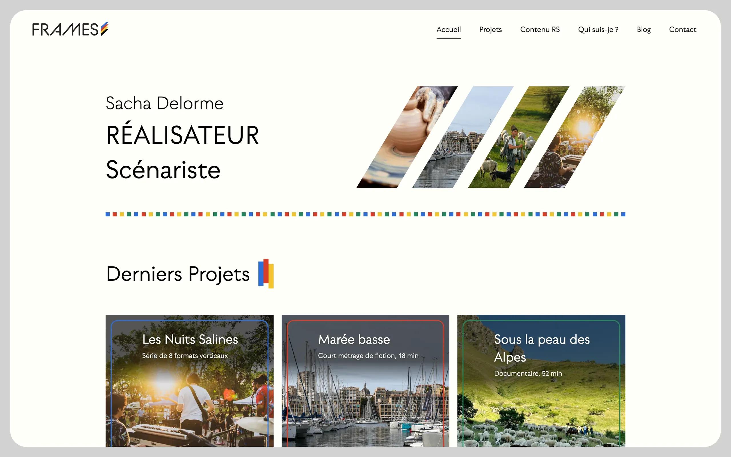
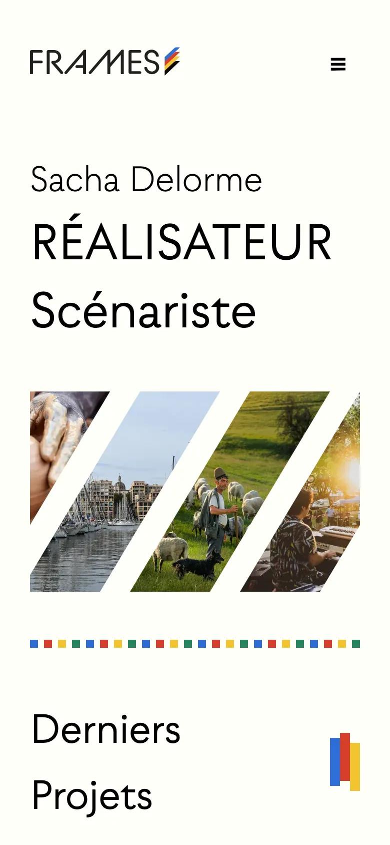
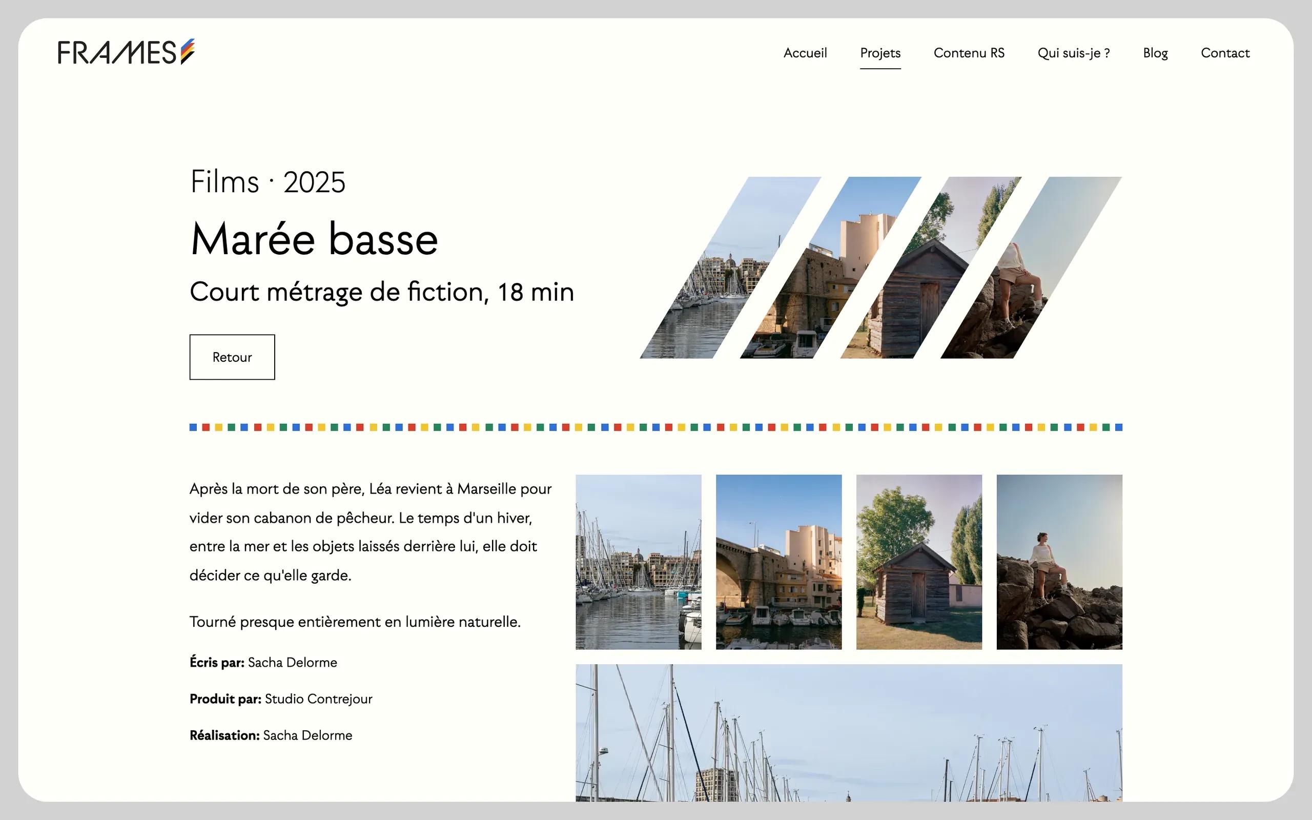
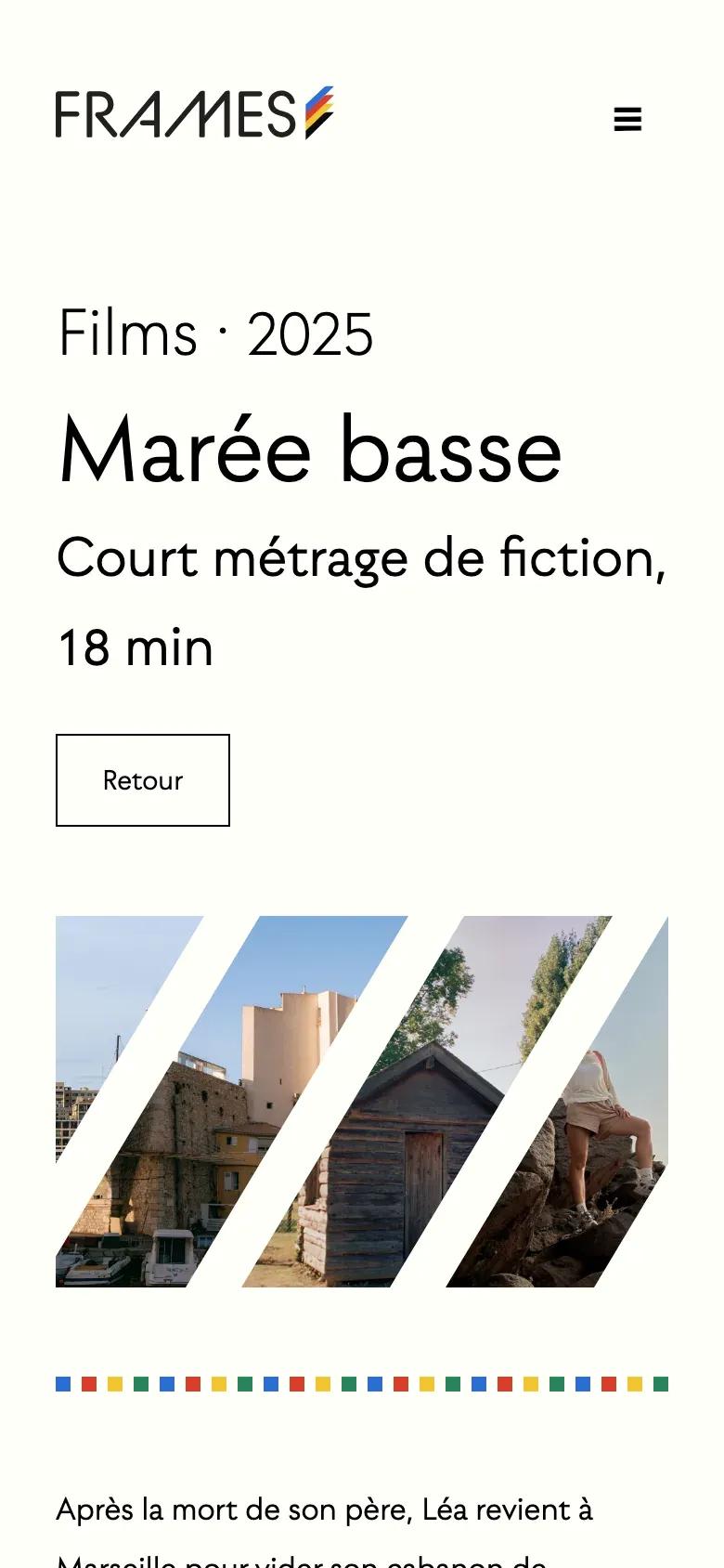
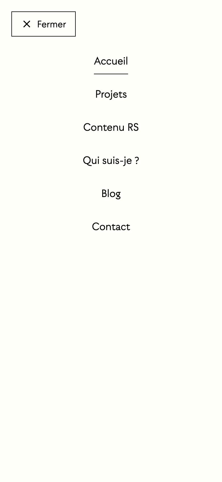
The open menu. 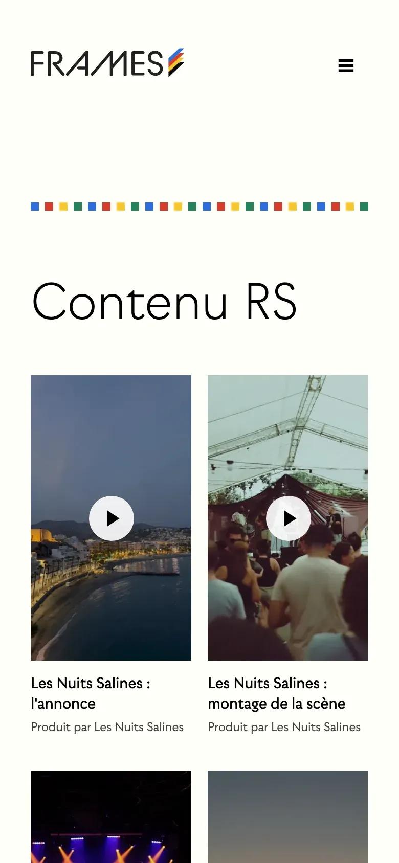
Contenu RS: videos play on tap. 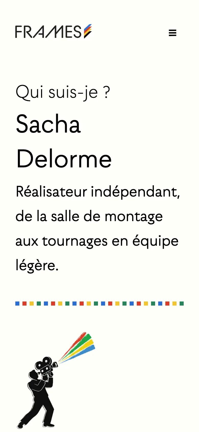
About: the illustration moves above the text.
06Under the hood
What you don't see, but what matters.
Behind the animations, a foundation I rebuilt: stable, up-to-date versions, data read on the server, media kept apart and demo content that can be re-imported without duplicates.
Under the hood
Next.js 16 and Payload CMS 3
From a beta (Payload beta, Next.js 15.0, a React release candidate) to pinned stable versions: Next.js 16.3, Payload 3.90, React 19.2. Dead code from the starter template removed.
Security upgrade
On 7 October 2026: dependencies updated, GraphQL turned off (the site uses the REST API), security alerts brought down from 65 to 1.
Server-side data
Pages read the database through Payload's Local API, directly on the server, with no HTTP call to their own API.
Media on Cloudflare R2
Images and videos served from a dedicated subdomain. Site hosted on Heroku, MongoDB Atlas database.
Replayable content
A script imports projects, articles, case studies, logos, videos and the biography from a JSON file, without creating duplicates.
Contact form
Sent through Brevo from an authenticated domain (DKIM), a honeypot field against bots and at most 5 messages per hour per IP address.
Respect for visitors
No cookies on the public site. Third-party content (YouTube, Vimeo, Instagram) only loads on click.
Method
The code is AI-assisted (Claude Code). The art direction, the interface choices and the review of every step remain mine.
In figures
100
Lighthouse accessibility
8 pages tested, on mobile and desktop, 3 runs each (Lighthouse 13.5, 9 October 2026).
100
Lighthouse best practices
8 pages tested, on mobile and desktop, 3 runs each (Lighthouse 13.5, 9 October 2026).
65 → 1
dependency security alerts
The last one is in the build tooling, with no published fix.
0
cookies on the public site
Checked on 9 October 2026 on 10 pages, at 1440, 768 and 390 px.
Components and illustrations
The components from the Figma mockup: project and article cards, service cards, buttons and filters. In the mockup, a gradient stands in for the photo. And the illustration of Sacha, drawn for the About page.
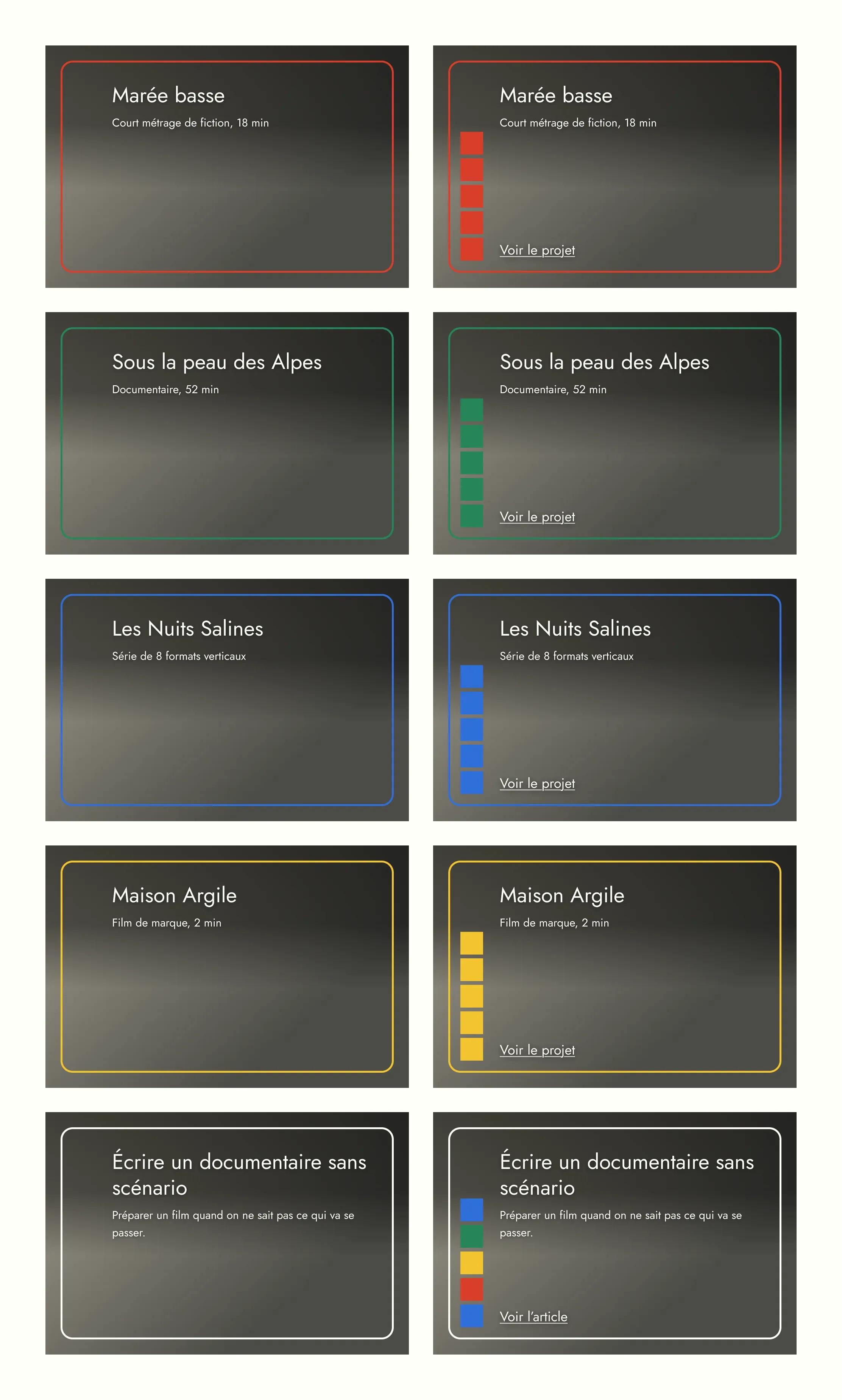
Project and article cards, at rest and hovered, one color per category. 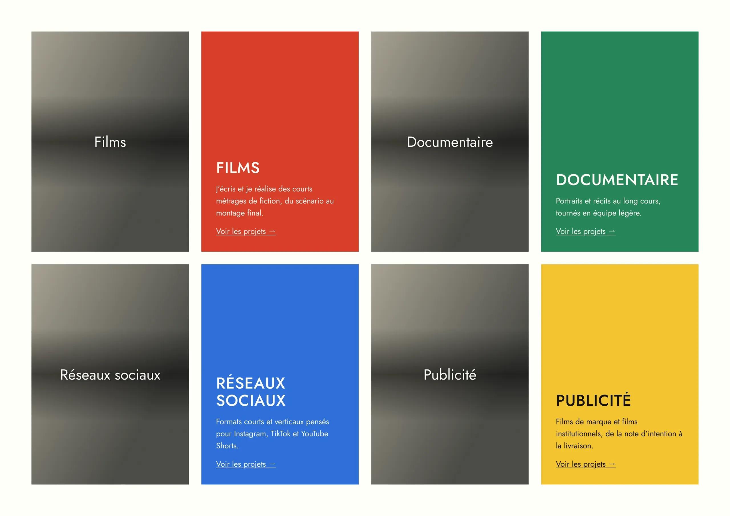
Service cards, at rest and hovered. 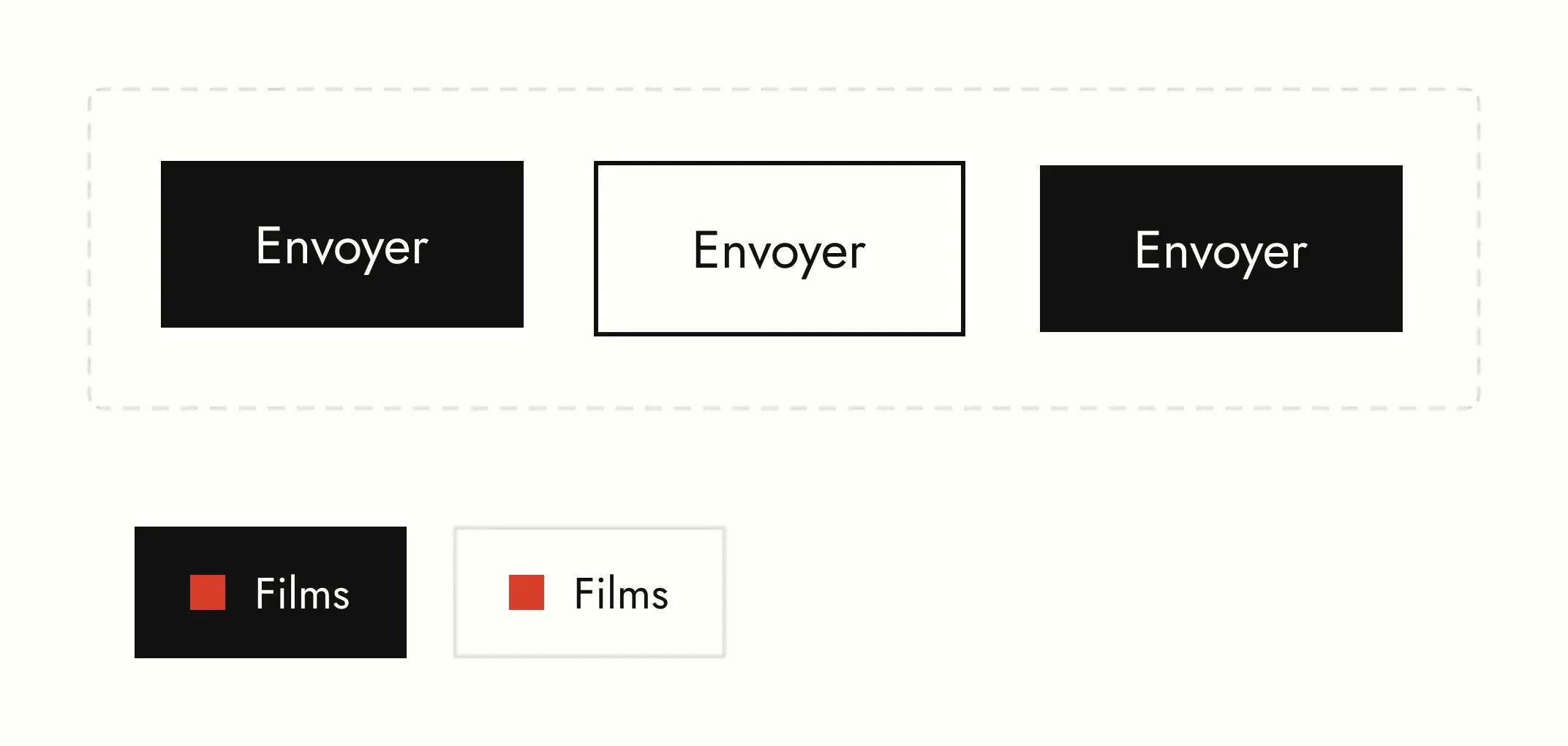
Buttons and category filters. 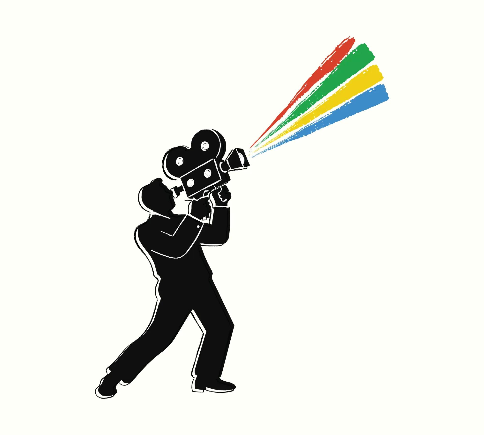
Sacha, camera on the shoulder. Illustration: Guillaume Salle.
Visit the live site
frames.webjuno.comDemo site designed and built by Webjuno. The director, the projects and the texts are fictional.